Graduate Pedagogy Shadowing
Week 1 | Drawing 1 with Sarah Jones
This class focuses on fundamental techniques of drawing and is taught online over Zoom.
Tuesday, January 12 - Introductory Day
Sarah starts by introducing a project that will be ongoing throughout the semester: the students will complete one small drawing everyday on the topic of their choosing. In the end, the students will have a series of drawings that show the progression of their skills and thought process.
By now, most of the class is present even though a few are still joining. Everyone takes turns giving a brief introduction of themselves, which includes their name, year, major, and where they’re from.
Finally, Sarah goes over the syllabus and tells everyone what materials to bring for the next class.
Sarah is very personable. She shows interest in what everyone has to say about themselves by asking questions and making comments. She wasn’t harsh towards any of the students who joined late.
As for Zoom, the class communication can be a bit clunky. There is a slight delay that varies for everyone which can lead to people talking at the same time. Muting and un-muting the mic also contributes to a segmented style of conversation, but is necessary to keep the call free of white noise.

Matisse sketching The Dance. ahrc.ukri.org
Thursday, January 14 - Blind Contour Drawings
The class starts with a blind contour drawing exercise: without looking at the paper, draw yourself using contour lines (the outlines of your features and details). The students are allowed to lift their pencil off the paper and reposition (without looking) and they draw for 10-15 minutes. After the time is up, everyone shows their drawings and briefly talks about their experience.
The next exercise is a blind contour drawing using a pencil taped to a three foot long stick. The students are allowed to look at their drawings in order to reposition themselves. The timer is set for 20 minutes this time.
Sarah brings up a picture of Matisse drawing figures on a wall with a bamboo stick as an example for the class.
Overall, the class went well. The students were very mature and didn’t complain about the exercises. In the past, I’ve heard a lot of griping about blind contour drawing — everyone hated it. If anything, I think the students were trying to keep up with exercise. Since the students are working at home, not everyone had a good drawing set-up with a full-length mirror and drawing table/stand. Some of the students misunderstood what the sticks were for and brought ones that were too flimsy or ones that weren’t appropriate to use as a drawing instrument.
Week 2 | Relief Printmaking with Jim Bailey
This class focuses on the fundamentals of relief printmaking with Lino printing and woodblock printing. Jim created a webpage called Printana where the students can find all relevant information pertaining to the class.
Monday, January 18 - Martin Luther King Day; No Class
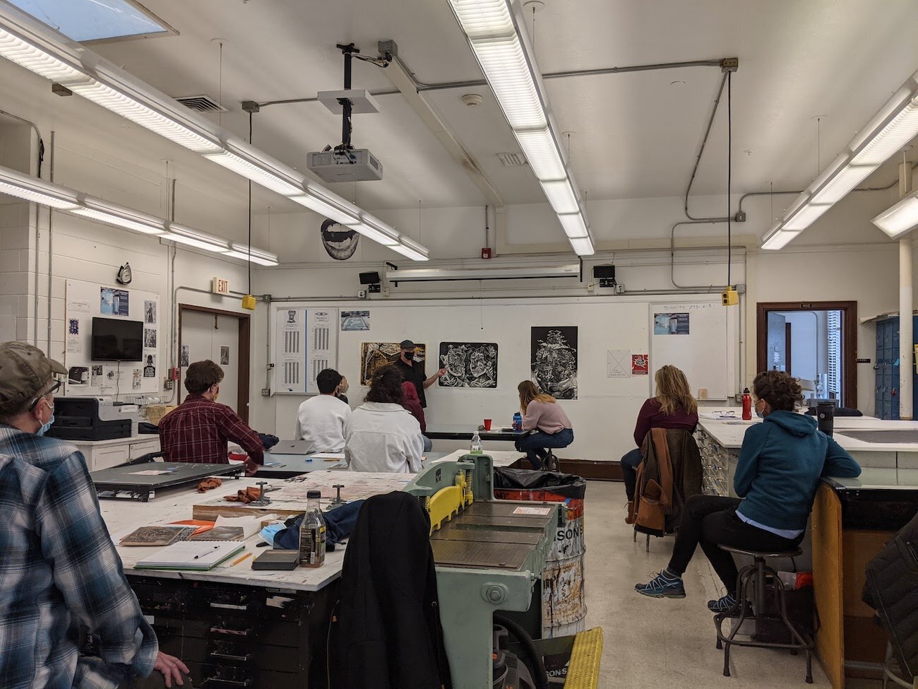
Wednesday, January 20 - Printmaking History Presentation and Work Day
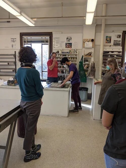
Jim continues a PowerPoint presentation on the history of printmaking. The presentation includes historical and contemporary examples along with the evolution of printmaking. Jim adds bits of humor relative to the class material. A DotCam (real-time projector) is also used to show print samples. The students take notes in their sketchbook, which will periodically be turned in for grading.
After the presentation, the class continues to work on Project 1: Self Portrait. Some students work on their sketches while others are ready to laser/ xerox print and transfer their designs to the linoleum block. Jim walks students through the transfer process (I believe he gave a demonstration in a previous class). The students are left to figure out what they can and help each other while Jim assists other students. Towards the end of class, Jim reminds everyone that cleaning up is also important to the process.
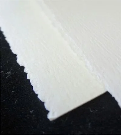
Deckle edge from paper making process. Cutcardstock.com
Week 3
Monday, January 25 - Work Day
Jim gives a quick lecture about paper. Since paper is a primary substrate for printmaking, it is important to understand the variety of paper and how to prepare it for printing. Jim explains the pros and cons of the different papers and where they can be purchased. He also explains the stylistic differences between cutting paper and tearing paper. Cut paper leaves a clean edge, while torn paper leaves a “deckle” edge (a feathery, fibrous edge). Jim does a quick demonstration for each type, including how to tear with water to make organic shapes.
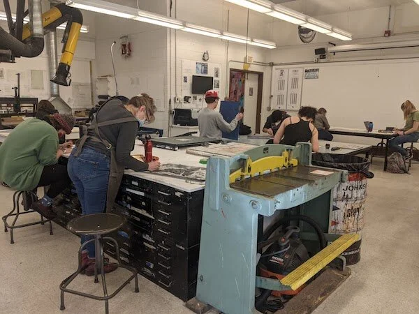
The class continues working on Project 1. Most of the students are working with their linoleum blocks by now—transferring their designs or carving. A few students are still sketching.
Jim does “the rounds”, making sure to check-in on all the students and assist as needed. He gives a social media disclaimer that he may take photos of the students working and their projects. He also ensures everyone that they can refuse at any time.
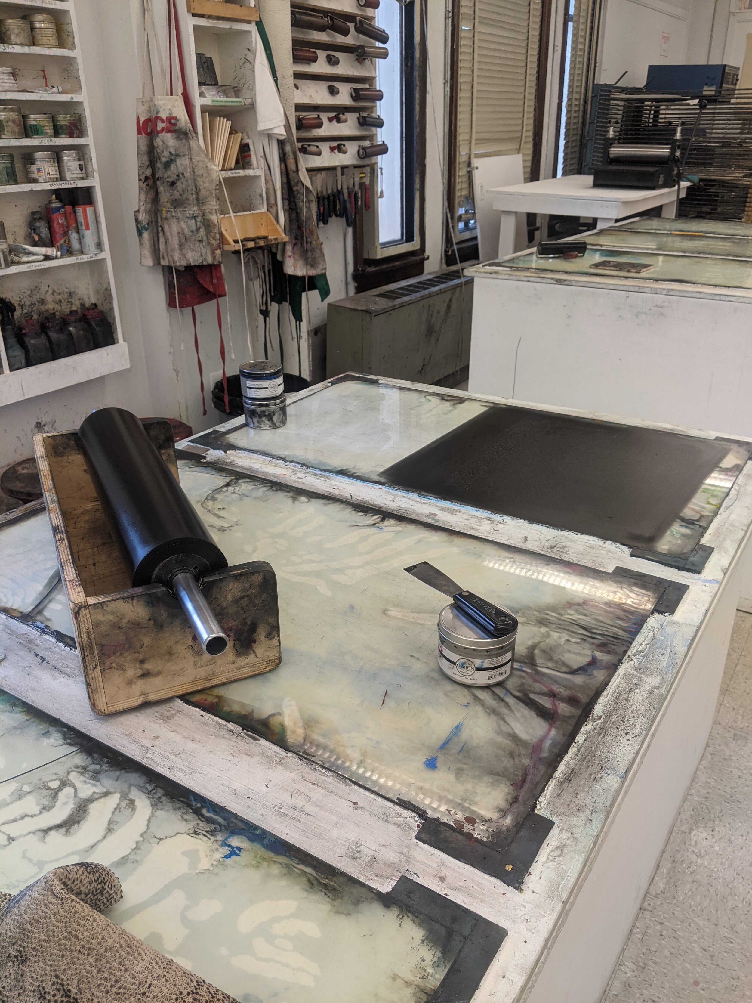
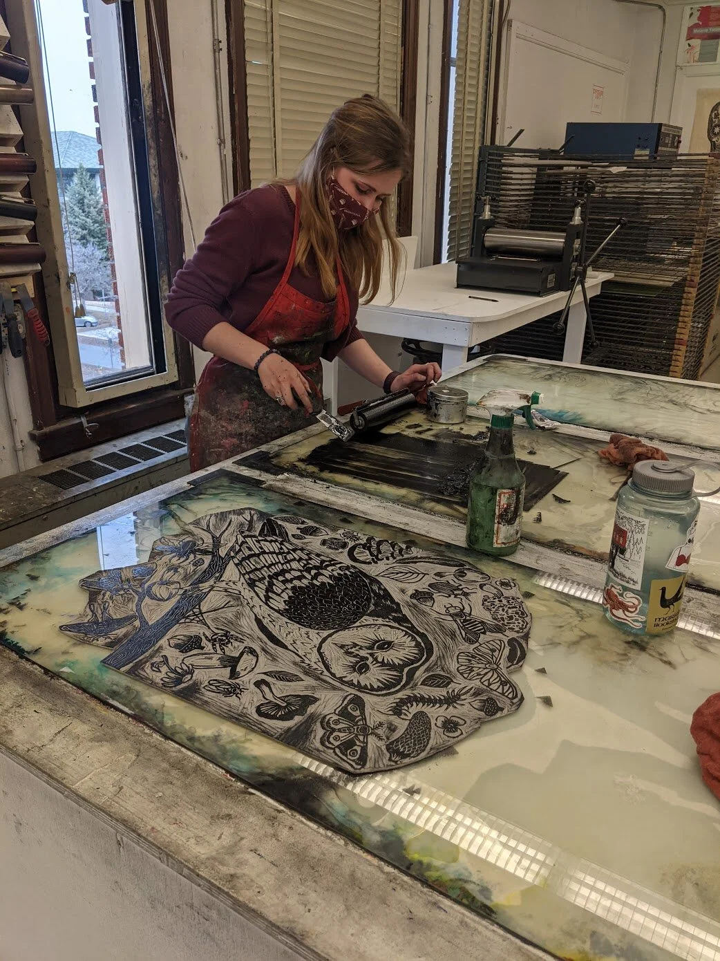
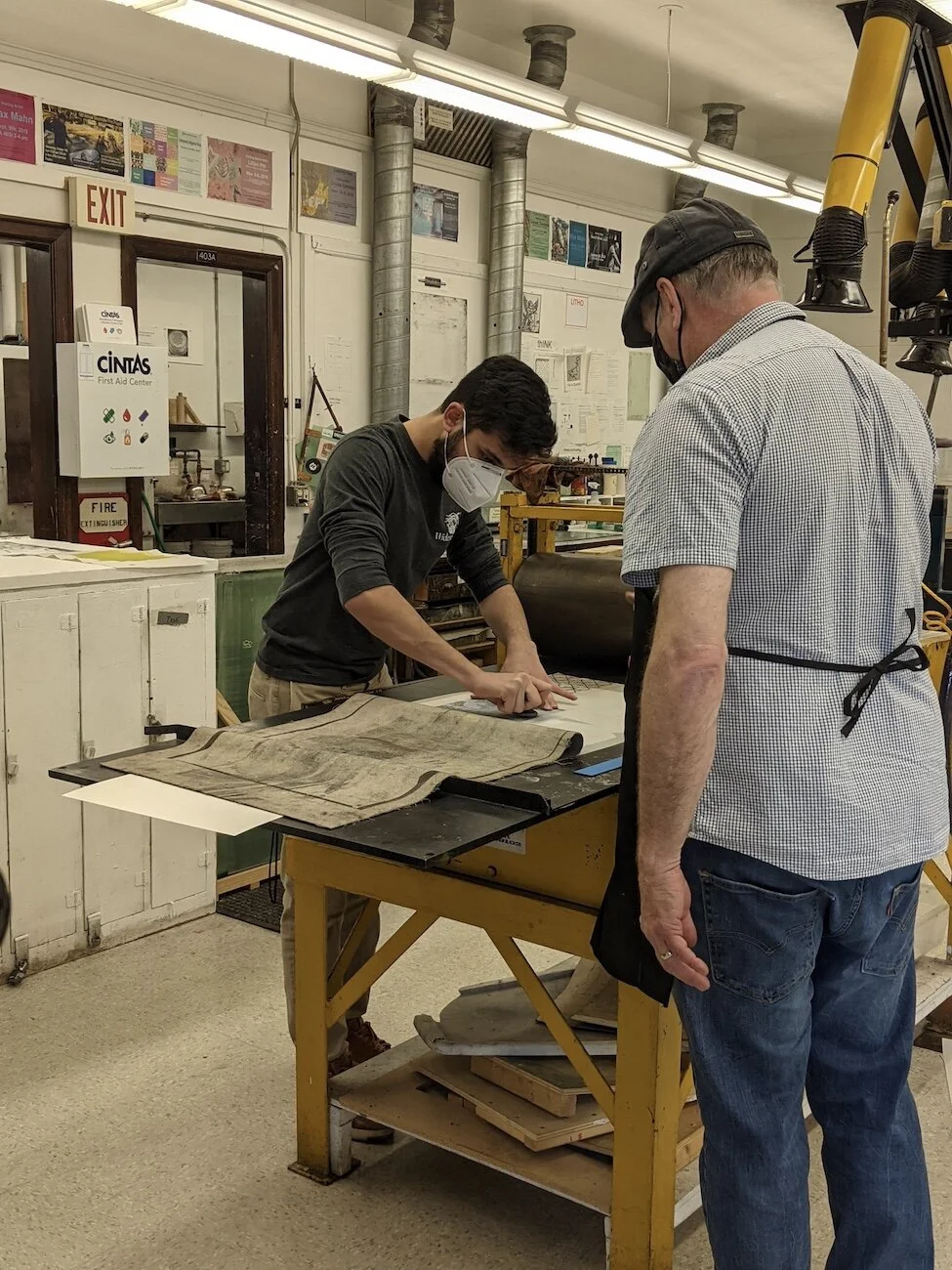
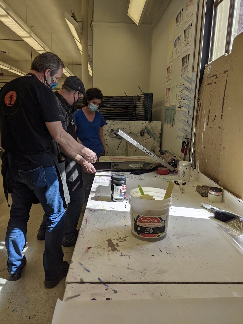
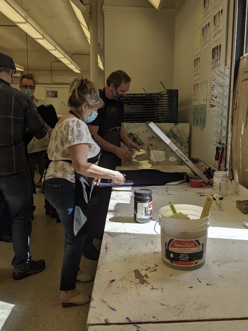
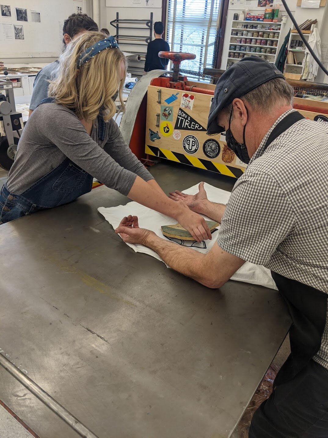
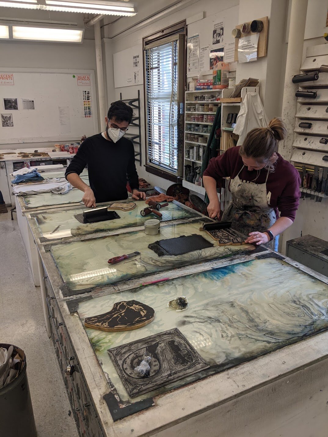
Wednesday, January 27 - Inking and Printing by Hand
At last, the class gets their first demonstration of printing. For Project 1, the class will be printing by hand using a burnishing method.
Before the demonstration begins, Jim goes over the materials and tools they will be using along with some pre-printing considerations:
Oil-based ink - Linseed oil and pigment.
Brayer - An ink rolling tool; ‘spread thin’; red brayer (60) made of a harder rubber for thin applications of ink; black brayer (40), softer, for thick ink applications and uneven surfaces.
Check linoleum for bumps and imperfections created from the manufacturing process.
Registration: The registration is used to position the paper on the block accurately and repeatedly.
Outline the paper substrate onto a sheet of newsprint and then remove substrate.
Position linoleum block within the outline and then trace it. Consider border thickness- even, uneven, or museum mount (thicker border at the bottom).
Tape a sheet of duralar (a kind of transparency sheet) over the newsprint along one edge to protect the registration from ink. Ink can be wiped off of the duralar with a rag as needed.
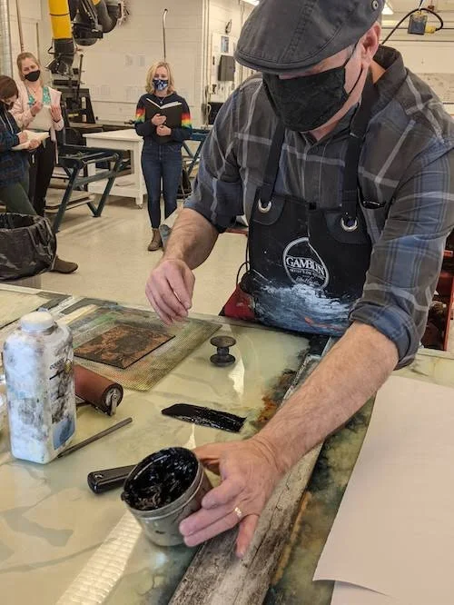
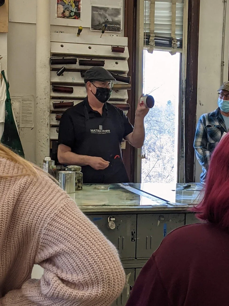
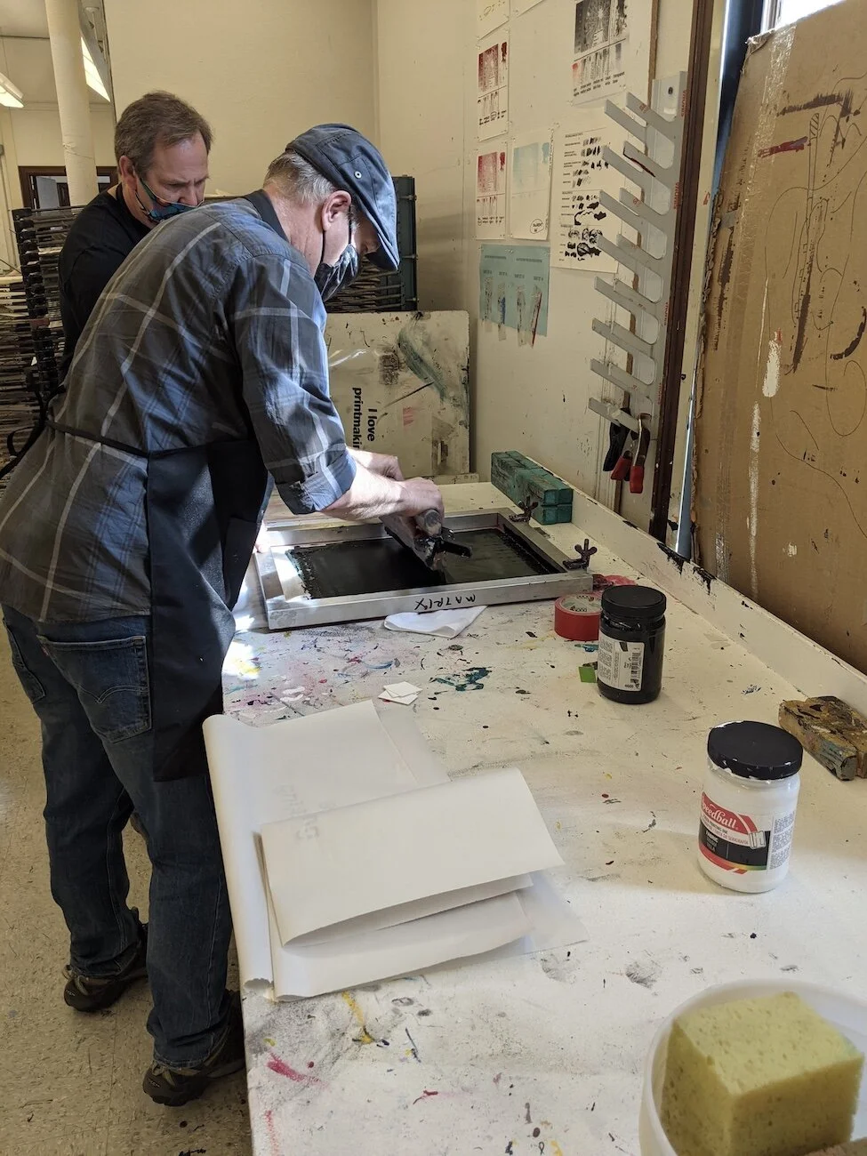
Jim Bailey starts to make an ink slab for printing.
Ink Slab: A layer of ink on glass used for depositing and controlling the thickness of ink on the brayer.
Apply a line of ink towards one end of a glass pane that is a bit less than the width of the brayer.
Start from the ink line and roll the brayer down the pane. Use a combination of short and long rolling motions to thoroughly coat the brayer.
The ink slab shouldn’t be too textured or too flat; listen to the sticky sound of the brayer rolling through the ink as a way to gauge the thickness.
Apply more ink as needed or scrape ink off the slab to thin it.
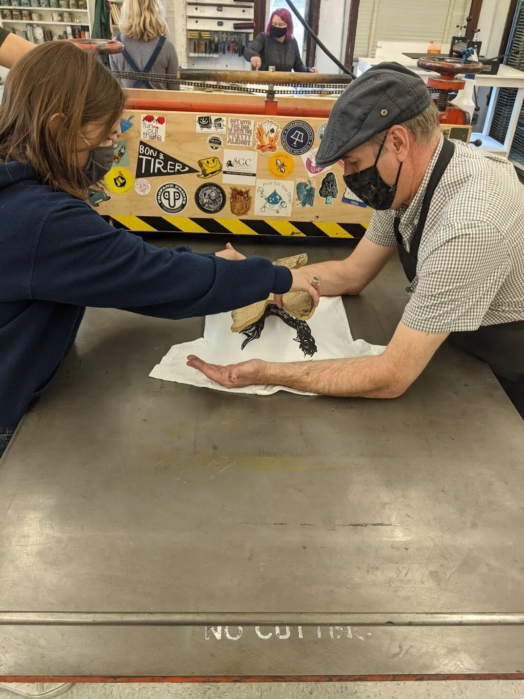
Printing
Roll brayer over the linoleum block; ensure that all details are inked.
Place block on the registration, ink side up.
Line one edge of the paper over the registration and let the rest of the paper fall onto the linoleum block. The ink keeps the paper adhered to the block, so it can be moved to a rubber mat where it won’t slide while burnishing.
Burnish the paper over the details of the linoleum block using either: a ‘baren’ (disk-like tool for burnishing), wooden spoon (metal one can work too), or an alternate tool like a cabinet knob.
Lift paper partially off the block to check the print quality. Burnish areas again or add more ink as necessary to achieve desired coverage. Do not lift paper completely off until the print is complete—placing the paper back on may create a shadow image.
Place completed prints on drying rack. Oil-based inks require longer drying times.
Jim demonstrates how to print and how not to print. He over-inks a block to show how the details can be lost as they are filled in with ink. He also points out ‘salting’ (specks of the paper show through the ink due to lack of ink or pressure) and halo dots created from blemishes on the block.
Clean-up Demonstration
Scrape extra ink off the ink slab and store in saran wrap or dispose of. Pour some vegetable oil over the remaining ink and roll brayer to coat both it and the slab. Roll the brayer over newsprint to remove excess ink. Wipe remaining ink with a rag.
Clean linoleum block by either wiping it down with a dry rag (don’t use oil) or run it through the press with newsprint a few times to print off the remaining ink.
Make sure all surfaces are clean of oil, ink, and trash.
The students work on their project for the remainder of class. Two-thirds of the class begin printing while the rest worked on their blocks. It is unusual to have so many students printing at once, but they all helped each other and learned to share the available space. Jim helped to disperse students to other areas, creating ‘stations’ where people could ink their blocks then move to another area where they could burnish.
Week 4
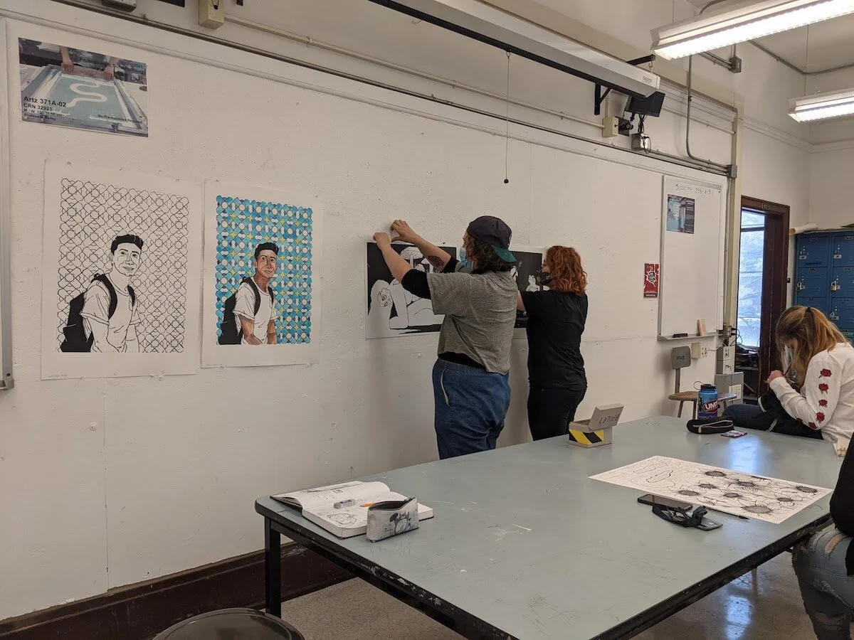
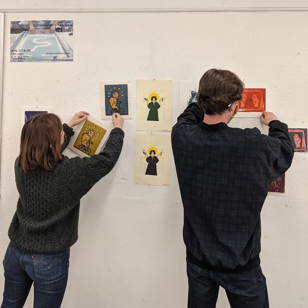
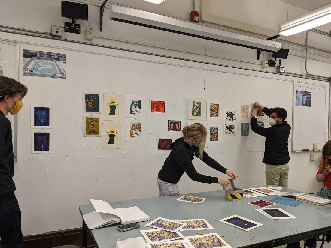
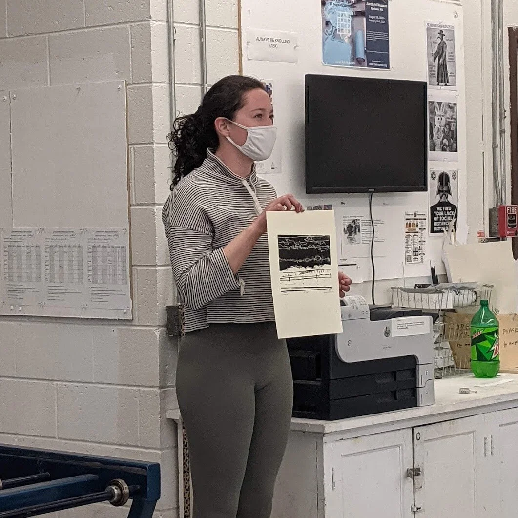
Monday, February 1 - Critique of Project 1: Self Portrait
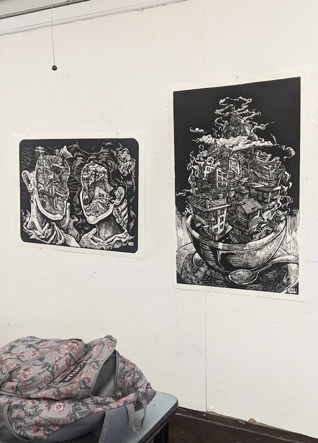
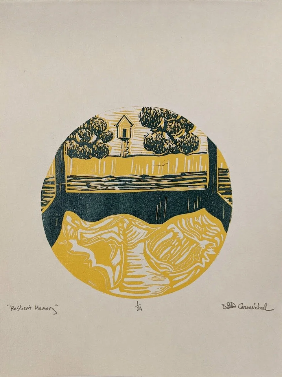
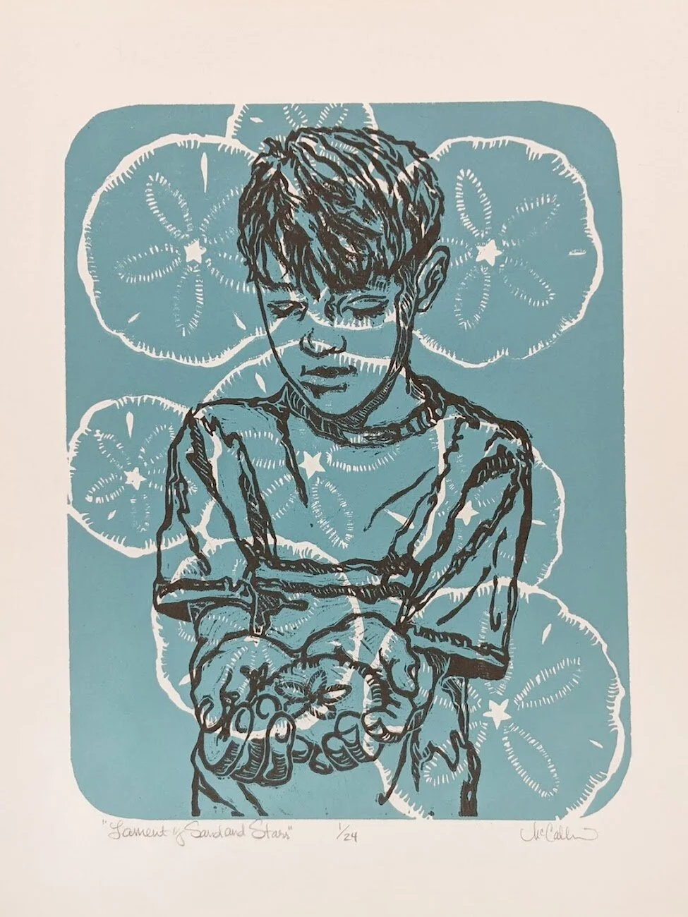
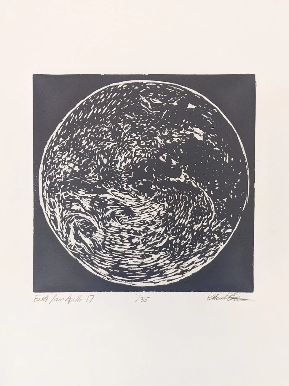
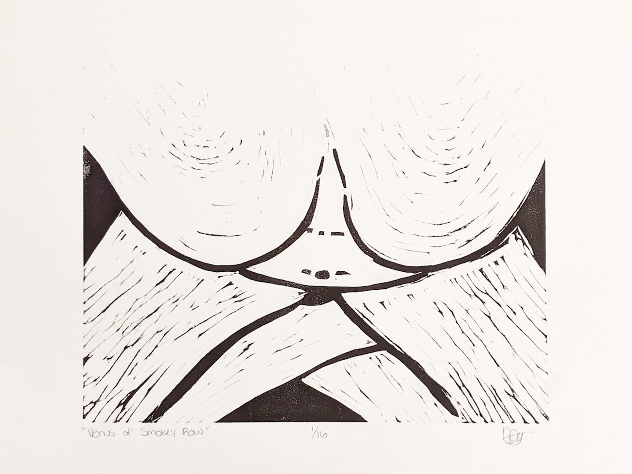
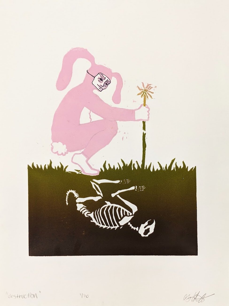
Students had to create a self portrait using linocut printmaking techniques. The self portrait had to show an aspect of the person’s personality and could be anywhere from realistic to abstract, but needed to reference the figure in some way. The students were encouraged to experiment with various methods of mark-making. All prints were in black & white, no grayscale.
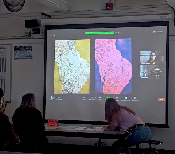
Everyone hands in one print which Jim projects onto a screen via the DotCam. Prints are chosen at random. Each student’s name is written on a stick and picked at random to answer one of five prompts for critique. Prompts include questions such as: How did the artist choose to present the figure (headshot, bust, full body, etc)? What mood is conveyed, what do other supplements (such as the background) tell you about the artist? What is a strong quality in the print, what could be improved on? Once the questions are answered, the artist shares their intent and answer questions. Afterwards, anyone can give feedback, including Jim and I.
The critique was a little rocky to start. I think the first few students were taken aback because they weren’t familiar with the questions beforehand. Some didn’t know what to say or how to answer. Things went smoother after the first round and knowing what questions to expect. Voice projection was an issue, which got better as people became more comfortable with talking in front of the class.
Jim’s ‘stick-and-prompt’ method works at getting everyone in the class to participate and consider relevant questions for critique, however, most of the students are still learning how to observe and interpret in formal and conceptual ways. I’m sure these critiques will get better with time, but I wonder if there’s a way to help the students.

Print labeling. Printgonzalez.com
Wednesday, February 3 -Supplemental Lecture and Project 2
Jim shows how to edition, title, and sign prints. Use a pencil to write these details—using ink could damage the print by way of bleeding and discoloration over time, plus it is not as subtle as graphite. Where to label the print is of the artist’s choosing, but typical placement usually occurs below the printed image within the margins, directly on the printed image in the case of a full bleed, or on the back of the print. Regardless of placement, the format has a set structure—edition number/ print acronym on the left, title in the middle, signature on the right (date is optional).
Afterwards, Jim gives a presentation on German Abstract Expressionism. The presentation includes the historical context, artists of the time, and stylistic qualities of the movement.
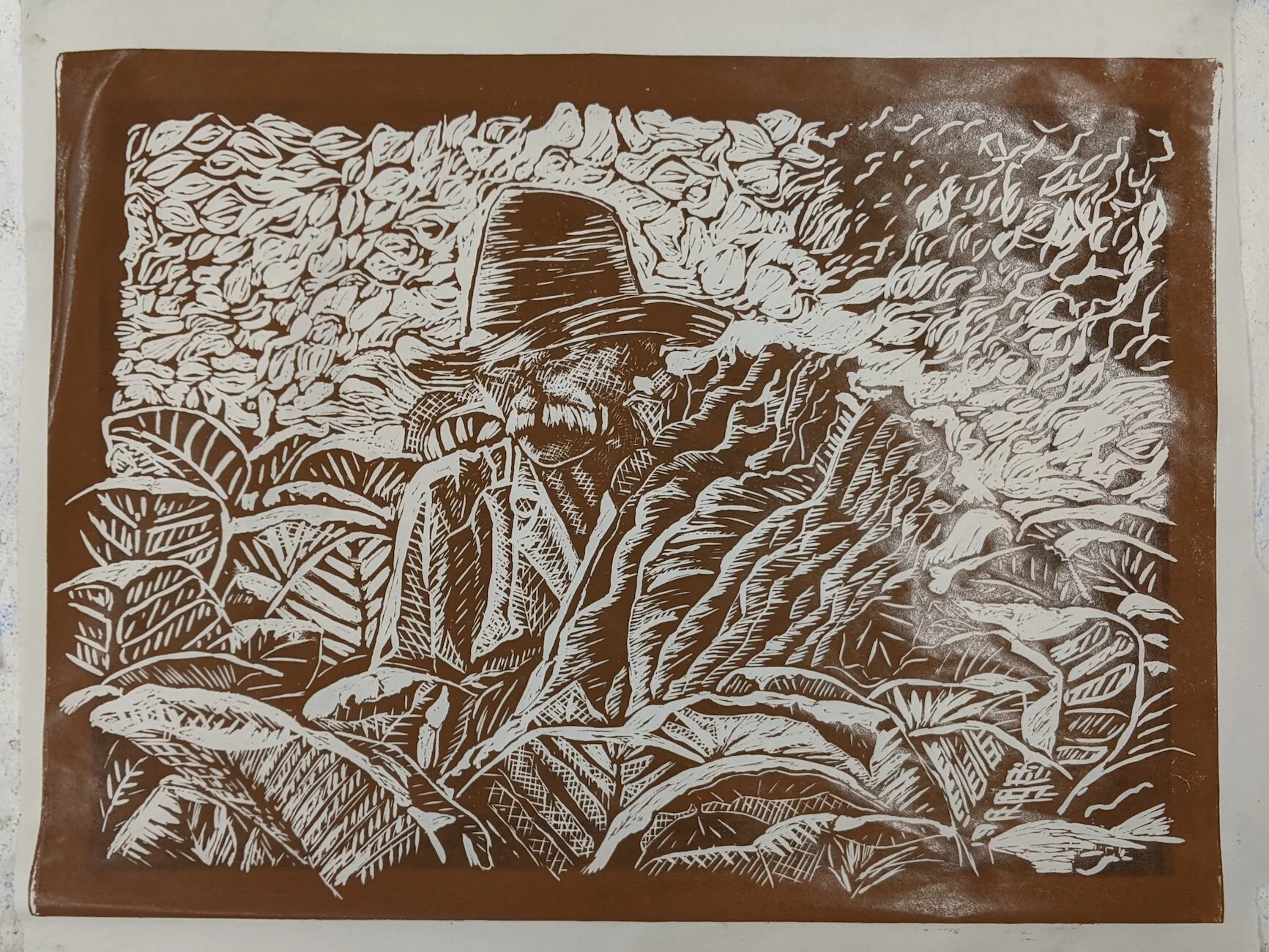
Finally, Project 3: Cliché is introduced. Each student picks a term from the List O’ Cliché’s while a second term is picked for them at random. The two terms must be used in some way to create a print that transcends the cliché. The rest of the parameters are as follows:
The image must be a minimum of 8” x 10” on linoleum, with 1” clean borders.
5 high quality prints on high quality paper
Two of the prints must be hand-colored or on dyed paper.
Week 5
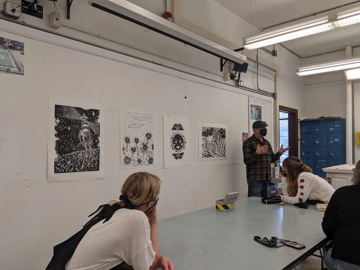
Monday, February 8 - Artist Presentations
The name of a printmaker is written before every student on the tables. The students have created presentations to to introduce their respective artists to the class. The presentation parameters are as follows:
A five minute presentation
A minimum of five images, of which at least five are of the artists prints.
Brief biography (where are they from, why are they important, are they living or dead)
Brief artist statement of what their work was about.
After each presentation, Jim gives some more insight to the artists. For instance, he explains more about their work process and techniques, historical information, or about their personalities if he has met them.
Wednesday, February 10 - Artist Presentation Continued and the Print Press
The remaining students finish their presentations.
Afterwards, Jason Clark gives a demonstration on how to sharpen carving tools. Jason is an Adjunct Professor and the 2-D and 3-D Technician in the School of Art at the University of Montana.
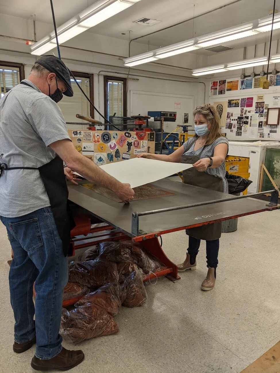
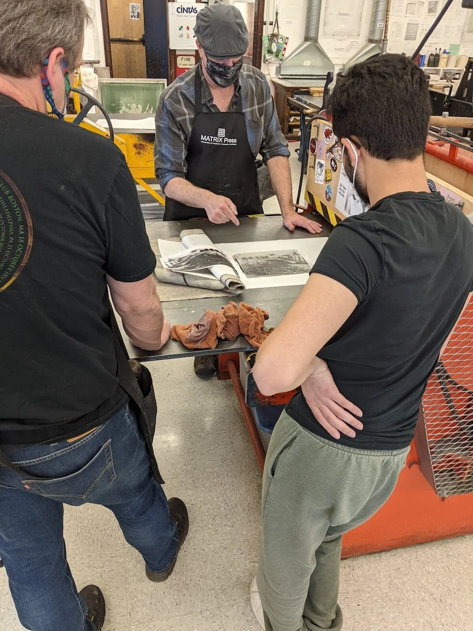
Jim started the class with printing by hand because it is something you can do on your own without a printing studio and it makes you appreciate the print press more. Hand burnishing is more labor intensive; you need to use a bit of elbow grease to ensure that all your block’s details are printed onto the substrate and it takes more time. On the other hand, once you get the press calibrated correctly it can exert anywhere from 200 to 500 psi, printing in under a minute.
There are a variety of print presses in the studio which Jim goes over with the class. Setting up your block and substrate is virtually the same for all the presses, but how they operate varies. He demonstrates how to adjust the pressure and how to activate the presses. He also explains other things to be aware of, such as, safety precautions, what the different sounds mean, and troubleshooting. Towards the end of the demonstration, Jim prints some samples with the press as a refresher for all the steps and to show the students how to work with the press in a real situation. I thought this was particularly helpful because explaining is very different from showing. During one print, the block wasn’t able to pass through the roller, so Jim showed how to adjust the machine and try again. We can’t always be prepared for these kinds of situations, so seeing how to handle such issues is beneficial for the class.
Jim announces that the due date for Project 2: Cliché will be pushed back by one day since there is no class Monday. There is not much time left in class, so he releases them early; they may stay and work since there isn’t another class afterwards.
Week 6
Monday, February 15 - President’s Day; No Class
Wednesday, February 17 - Workday
The students are either working on their sketches or starting on their linoleum blocks.
A few students attempt to transfer their images using the print press without Jim’s help. I observe and assist as needed, but we experienced some problems. We ran the print through the press and tried to run it back through in the opposite direction, but it wouldn’t move once it made contact with the roller. Jim had us watch the roller and we noticed that it wasn’t rolling in the correct direction—the press had glitched. This only happens once or twice a semester. We took a look at the print; the image turned out blurry, which also happened to another student’s transfer. The students wipe their blocks clean with acetone and wait to try again. This problem could be due to leaving the paint stripper (the medium for transferring the image off the paper and onto the block) on for too long or there were too many gray tones (the transfer works best with high contrast black and white).
Other students ventured out on their own to try new experiences. One student attempted to sharpen carving tools for the first time. Another student used the small print press, which is manually operated rather than using the familiar electric press.
Week 7
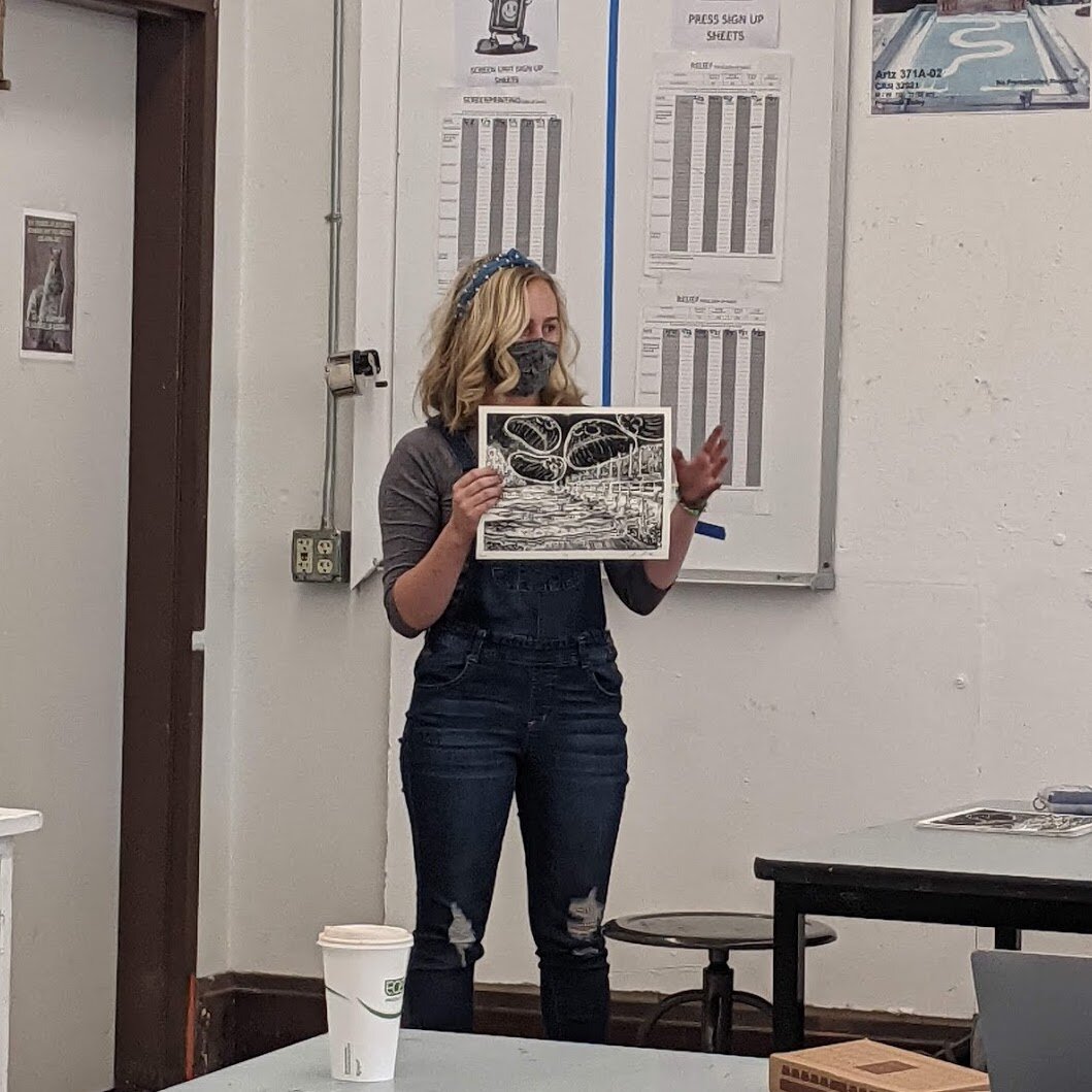
Monday, February 22 - Critique of Project 2: Cliché
Before the critique begins, Jim makes some announcements to the class. He instructs everyone to bring one black & white print and one color print to the projector table. He reminds everyone that the next project will be due March 15 and that on Wednesday, we will be Zooming with artist Christa Carleton.
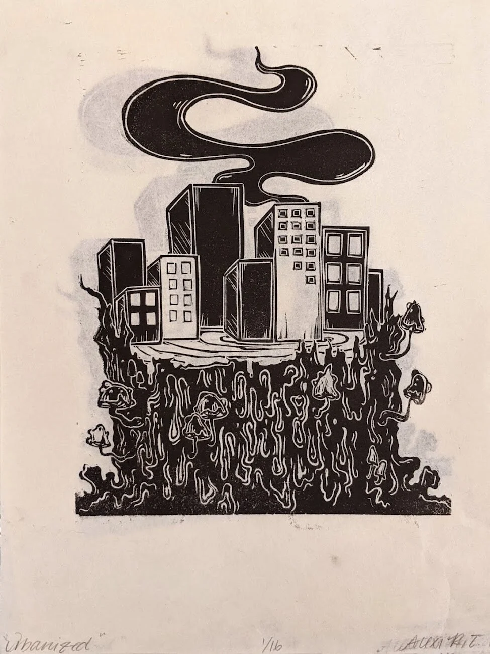
For this project, the students had to combined two cliché words into an image that would transcend the cliché. Project guidelines:
Student selects a word from the “List O’ Clichés”, the second will be drawn at random
Create a print that relies on the combination of the two imagery to transcend the cliché.
Minimum 8”x10” on linoleum with a minimum of 1” clean borders
5 high quality paper editions, 2 must be either hand colored or on dyed paper
We use the same critique structure where the student’s print is projected onto a screen and then students are selected at random to answer one of the prompts. Prompt questions included:

Project 2: Cliché
Can you identify the two cliché words? Is one more dominant than the other? What mood does the print convey?
Do you agree with the previous comments? How does the background work to support the imagery?
Is the overall image cliché or does it move beyond it?
What is working? What could be improved on?
Extra: How would the addition of a cat benefit the image. (This question was thrown in once for humor)
This is the first project where students are using color. The print ink is oil based, so it will repel water color while maintaining a true black. Everyone hand painted their color prints—it would have been nice to see some dyed paper. I wonder if no one tried to dye their paper because they didn’t know how.
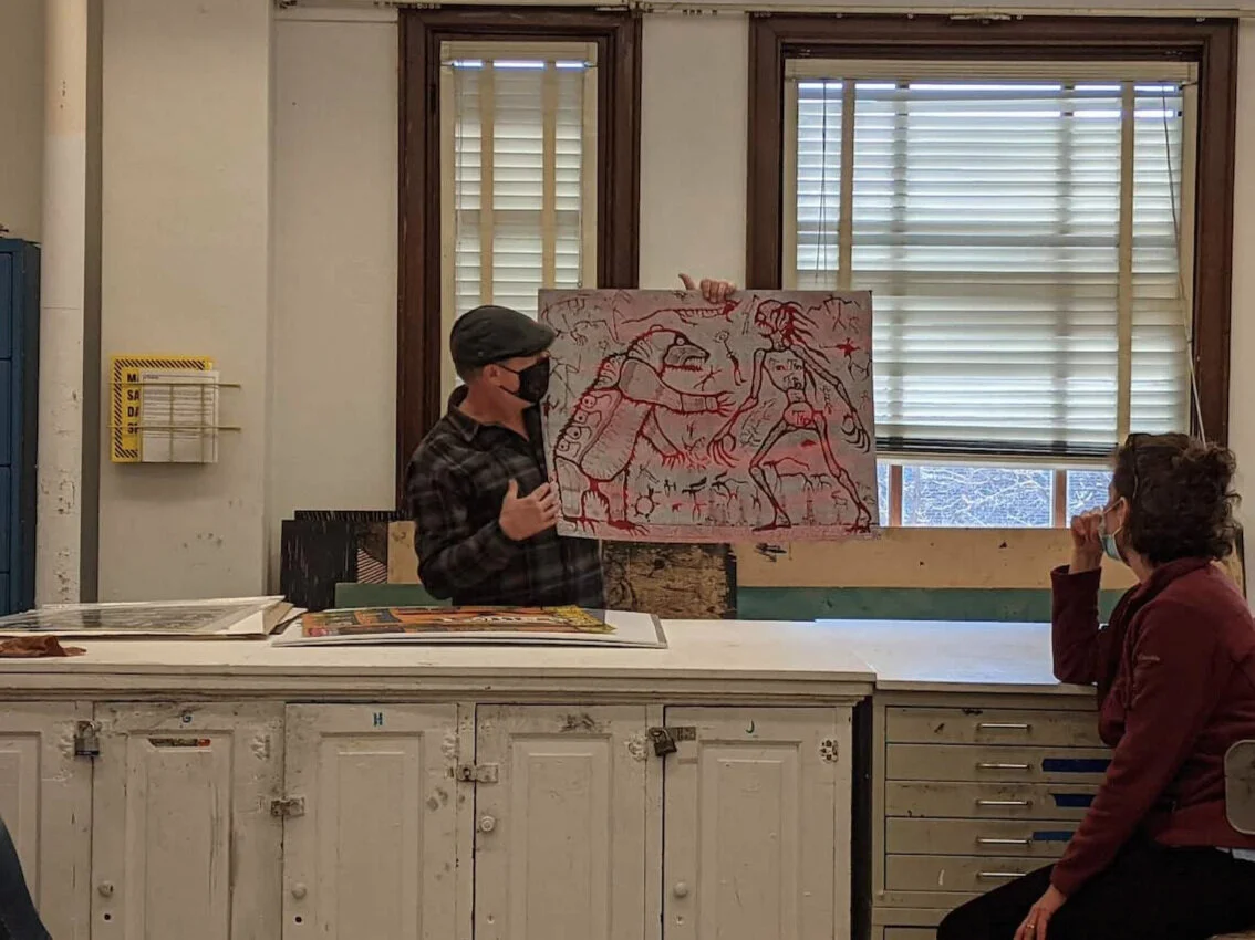
One of the projects referenced the painting The Lovers by Magritte, but many students couldn’t recall or haven’t seen it. It was helpful that Jim could look up the painting and project it onto the screen; it really helped everyone to understand the concept of the print.
The critique was a bit more lively. There wasn’t as much issue with voice projection. I think the students are getting more comfortable with talking in front of each other and they know what to expect from the critique style. Questions they struggled with: what two clichés can you identify? How to improve the work?
Wednesday, February 24 - Zooming with Christa Carleton
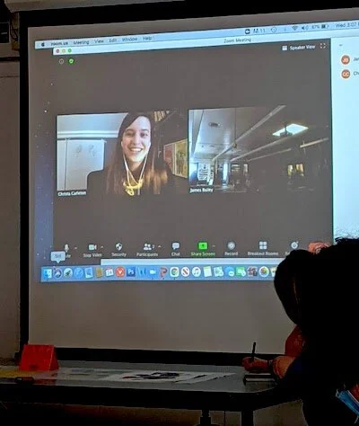
Christa Carleton resides in Missoula, Montana. She has her BFA and MFA in Printmaking and has been creating prints for over a decade. Christa works regularly in screenprint and woodcut, but letterpress is where her loyalties lie. The accumulation of antique type and rusty refurbishing projects are quickly piling up in her garage. While being a printmaker is a huge part of her identity it isn't her only love. Christa enjoys cooking vegetarian dishes, fly fishing, gardening, hiking, listening to podcasts, knitting, and pursuing the perfect cocktail.
Artist biography sourced from matrixpress.org
Artist Statement:
My artwork communicates messages of unrest, anxiety, and frustration as a woman. I relay these themes by using my unshakeable urge to be vulnerable. Through this urge I source my private memories, experiences, mantras, unspoken thoughts, and weak moments to bring fellowship and rapport with my viewer. I am driven to create work that focuses thematically on the agency of women because we live in a world where a woman’s voice is still unfairly marginalized, mocked, and treated unequally.
My intent is to spotlight the undisclosed and self-censored secrets I personally experience as a woman. Everyday society shies away from dealing with our concerns because they are uncomfortable and disrupt notions of what is normal. With my art I want to know that my experience is not singular and I want to upset society’s complacent status quo.
Artist statement sourced from Christa’s presentation.
Christa presents her work chronologically starting from her undergraduate studies while she pursued a BFA degree to her current printmaking pursuits. She provides many images of her work including process and details while explaining the context and intent. Her personality comes across as positive and sunny, but she also speaks very candidly about how her negative experiences have affected and contribute to her work.
After Christa’s presentation, the class can asks questions.
Week 8
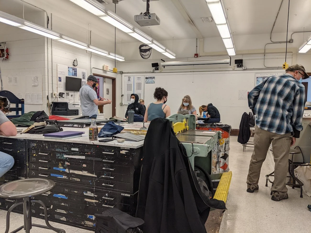
Monday, March 1 - Workday
Jason Clark substitutes while Jim is out of town for two weeks.
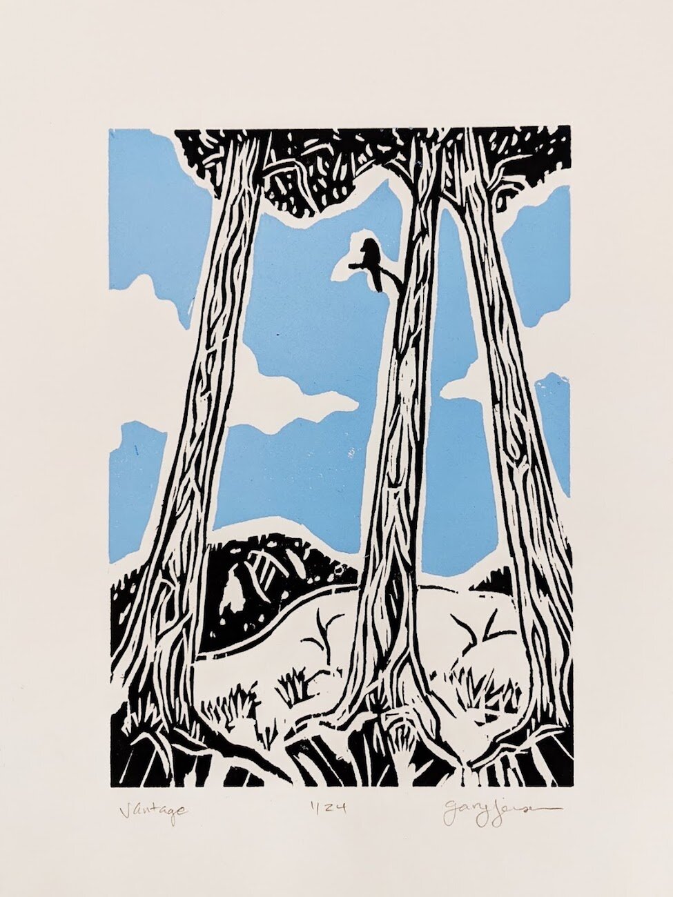
The students are working on Project 3: 18” x 24”. They will have to consider how the larger scale will affect their images and how their marks will change. Project parameters:
Open theme
Image size: Minimum of 18"x 24".
Edition of 4 high quality prints on good paper.
The class hard at work.
Most of the students are sketching their designs while others are transferring their images to the linoleum. A few students have already started carving.
Jason puts out some portfolios of past prints in case anyone would like to look through them. He helps students as needed.
I looked through one of the portfolios and asked some questions about the process of lithography; Jason is very prompt with answering questions and even pulled out a lithography stone and did a quick demonstration on how to use some of the materials.
Wednesday, March 3 - Workday
The students continue to work on Project 3. Quite a few students are absent, so the class feels quieter than usual, but there is now more space for students to spread out. Some more students have started carving while a couple are still working on their sketches. Jason answers questions and assists students as needed.
Jason also reminds the class that next week, the class will have the opportunity to bring in t-shirts or other things to screenprint on. Students get to choose from a variety of logos designed by past students relating to printmaking.
Week 9
Monday, March 6 - Introduce project 4 and Workday
Sample Project. White highlights, color midtone, black key image as shadow and outlines.
Jason starts class with a presentation to introduce Project 4: Multi-block/ Chiaroscuro. He reminds everyone that Project 3 is due on the 15th and then continues with pictures showing a step by step process of what Project 4 entails:
Birch woodblocks will be used for this project.
Start with cutting the image outline; traditionally black, but can be other colors.
Create a jig: Place the outline block on a piece of paper and tape matte board long the top and one of the side edges.
Tape a piece of Mylar at the top edge.
Ink your block, place it in the jig, flip the Mylar over it, and run through the press. The image is now transferred to the Mylar and can be reprinted onto the second block.
After toning the second block, place it into the jig, flip Mylar on top of it, and run through the press.
Now both blocks have the exact same image.
Cut out the highlights on the second block. All other areas will have the color which will be the mid tone.
The presentation also includes historical examples.
Jason clarifies that multi block printing and chiaroscuro are actually different. Multi block is about creating individual stand alone colors that come together to form the image; elements of the image are different colors rather than value.
The students take notes in their sketchbooks throughout the presentation (they will have a quiz on 17th). Some students ask questions to clarify the steps of Project 4 since you start cutting the last block you will print with.
Jason does a quick demonstration of the process. He starts with where to find the ink cans and how to properly scrape ink out and onto the glass. After creating an ink slab, Jason inks up the woodblock and places it into a jig that is ready to go. He adjusts the press and readjusts since the first run through was a little light. The birch block that the class will be using is a little thinner than the demo woodblock, so Jason doesn’t transfer the image— the blocks have to be the same height. He explains the rest of the process to make up for this.
The students ask questions throughout the demonstration, but Jason also asks if anyone has questions at the end. He mentions that he is showing the process now just to get everyone to start thinking about color. He notes that lighter colors are more translucent than darker colors; white is opaque and can be used to lighten odors; ink extenders can lighten colors while maintaining translucency. He encourages everyone to try mixing colors and quickly explains ‘blend/ rainbow rolls’ — creating a transition of colors on one ink slab.
Jason reminds everyone that he is here to help if anyone is ready to start printing their large blocks.
Total presentation and demonstration time: 38 mins.
Some blocks and prints are put out for the students to see.
Jason helps a student ink their large block by showing how to use a large roller.
He asks if anyone is opposed to music before putting some on.
Everyone is working on their project. One students is still laying their image onto the block, but everyone else is either carving or printing. Some students leave early.
Wednesday, March 10 - Workday
The students continue to work on Project 3. Almost all the students are carving their blocks except for one who is printing.
The rest of the class watches this student to get an idea of how they will be printing with the large roller. Jason comments and gives tips as everyone watches this mini demo. He briefly speaks about how to hold the large roller, inking setup, and what to watch out for when printing with the press since the large blocks can stretch as they roll through.
Today was also supposed to be a t-shirt printing day, but I think many students forgot because this is the last class day to work on Project 3 before their critique on Monday. Jason asks if everyone would like to focus on their projects and postpone this activity for another date—majority wish to focus on their projects.
Jason assists the students who are printing since handling the larger paper is a bit cumbersome. He walks around occasionally to give pointers or bring out samples for the students to view.
I thought it was effective when Jason said ”Tell me if I can help in any way” instead of “Do you need help?”. Simple change, but sometimes it can be reflex to deny help.
Week 10
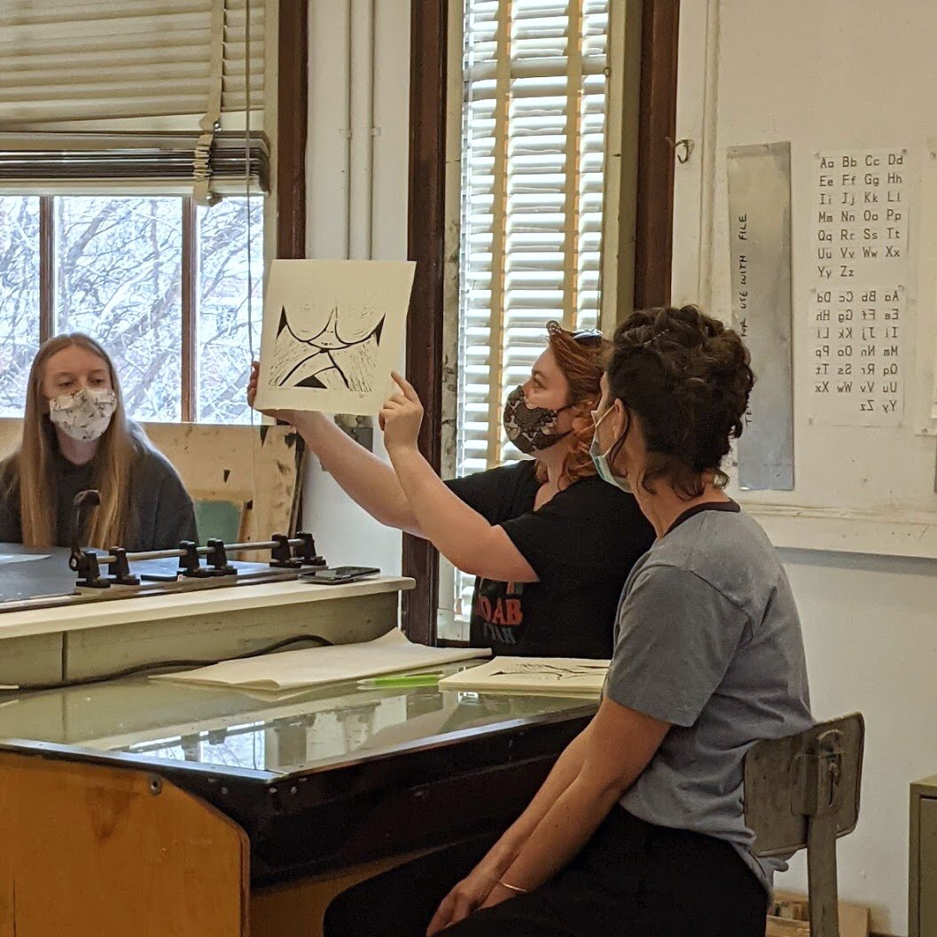
Monday, March 15 - Critique of Project 3: 18” x 24”
Today, I lead the critique and I decided to try out a different format. For the past critiques, Jim would project the prints onto a screen and call on students at random to answer a specific prompt. Since Project 3 required a large linoleum block, the prints were large enough to tack to the wall and view. Four prints were presented at a time; we started with a “cold read” where anyone could give feedback and then the artist spoke towards the end.
By now the students know each other better and are more comfortable with critiquing, so I hoped that this more traditional critique style would work as a conversational tool. I told the class to think of the critique more like a discussion and that the artist should also take the opportunity to ask the audience questions and get what they need to improve. I had prepared some prompt questions for when it gets quiet, but I forgot to bring them, so I winged it.
The critiques went pretty well. The students did seem like they were comfortable talking about each other’s work and many good points were made.
There were some things I would do differently in the future:
A couple of students didn’t add to the conversation. I was hesitant to call them out, so next time I might try walking around the class throughout the critique and discreetly nudge them to join in. Maybe I could bring people into the conversation by referencing something specific between them and the print—that way they would have a launch point to go off of.
There were some awkward moments of silence that I tried to dissipate. Sometimes it was successful, though a few times I would ask if anyone else had anything to add, which was fine, but I could have asked something more structured to deepen the conversation. For example, I could have asked about a specific formal quality of the work or something specific to using a larger linoleum block.
I could have guided the conversation better in order to keep the “cold read” format. Sometimes, the audience would ask a question that would give away the concept or intent of the piece and I feel like I could have interjected and asked the class to imagine what the answer would be rather than be told by the artist. I also think that letting the artist speak too early made the critique format a bit confusing for the subsequent critiques.
I had a timer on my phone to make sure everyone had enough time to critique, but I kept forgetting to set it. In the end we got through everyone and ended class right on time, though it might have been different if everyone critiqued (one persons was absent, and two others didn’t have their prints ready).
Wednesday, March 17 - Intro to Project 5 & Artist Presentations
Jim briefly introduces Project 5: Class Portfolio. the class must come up with some themes for the portfolio, which will be voted on Monday. The theme shouldn’t be too specific; it should be broad enough for various interpretation, but no so broad that the theme loses meaning (ex: dreams). . Not specific like snowman, but not so broad like dreams where it becomes meaningless.
Too narrow: Snowman
Broad enough: Navigation, odd things, terra incognita
Too broad: Dreams
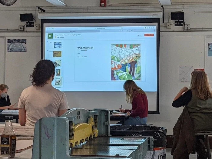
Slide presentation of Ethel Powers using Google Slides. Would be better to use presenter mode.
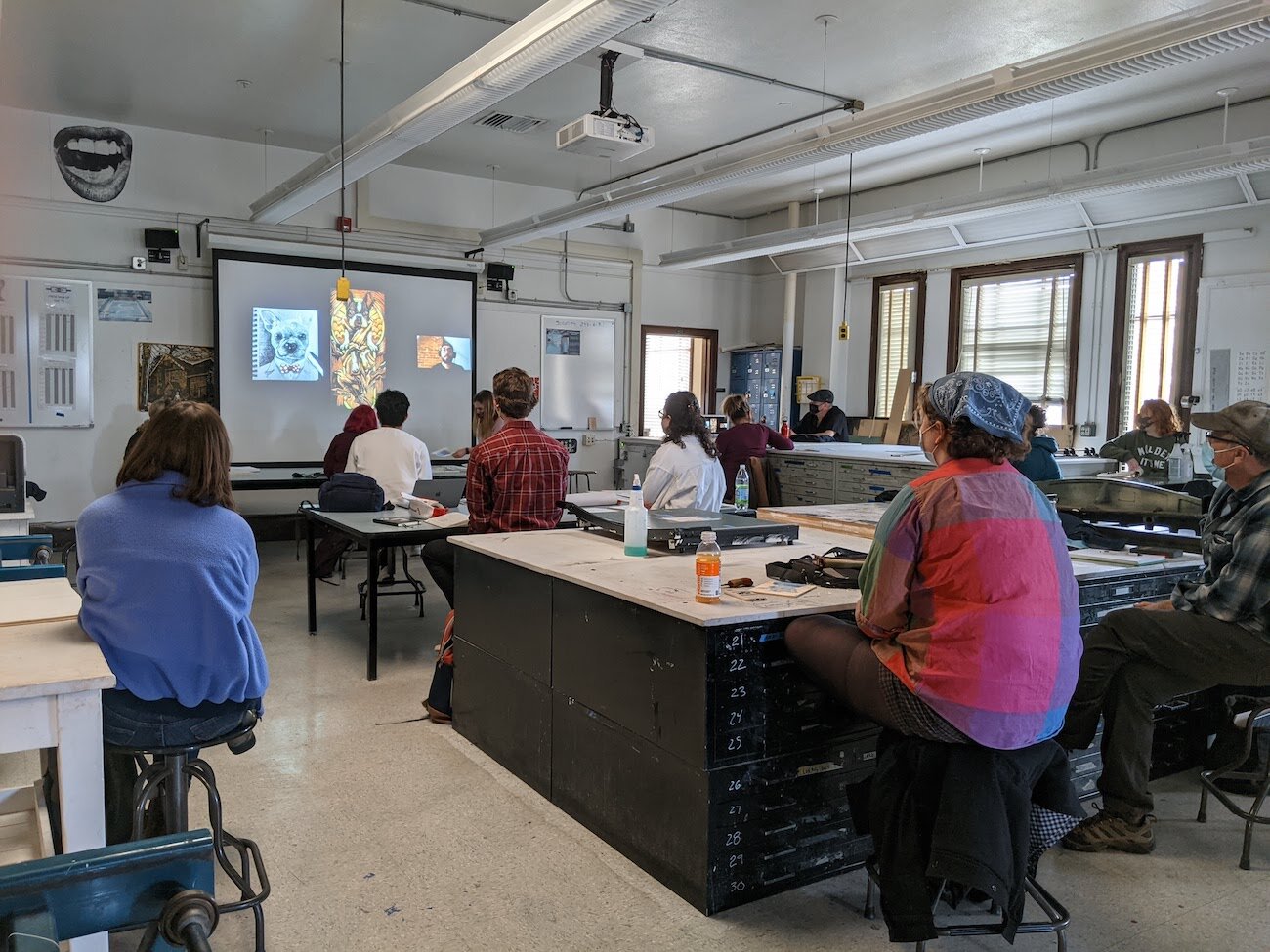
Each student prepared a 10-15 minute presentation on a relief printmaker of their choosing. The parameters are as follows:
PowerPoint presentation brought on a flash drive (to save time)
Minimum of 10 good quality images (select someone else if cannot find
Brief biography on the artist ( where are they from, why are they important, are they living or dead)
Brief statement of what their work was about
Students volunteer to present. Jim takes notes for each presentation.
What’s working with the presentations:
Image of artwork fills entire slide and includes metadata. The rest of the class is not as familiar with the work as the presenter, so taking time to look at the images is helpful. Some students elaborated further on the images, including information such as, artist intent, style, themes, history & context, or their own analysis of the art.
Detail images. Including detail images was particularly useful in highlighting things that could be overlooked. For example, there was a detail image of hand-stitched areas of a print, or details which the presenter explained were individually hand-carved lines.
Supplemental information. Other information such as, quotes or why the student chose the artist can be useful if it reveals information not readily available. For example, some artists had limited information, so students used quotes to show the intent or influences of artists in lieu of their artist statement.
Artist promotion. Some students included the artist’s social media, websites, and foundations, which is great in case anyone wants to learn more.
Feedback from the audience. Occasionally, a student would ask a question, which is great because it allows the presenter to clarify or provide more information. For example, the class could focus on one of the artworks and try to figure out how the artist printed it. Jim would also provide input. He would provide more information if he knew about the artist or relate them to other artists. He provided extra technical information such as the definition of washi paper, la poupee, and gelatin printing. Sometimes he would point out techniques in the artworks presented like the use of clatter or how to apply colors.
What’s not working:
Collaged/gridded photos. Having a few images on one slide makes them small and raises questions about their relationship to one another. I think multiple pictures work when they’re about the artist’s process or when the images relate to each other (demonstrate a theme; are a series). It’s important that the presenter gives context to the images.
Poor photo quality/ information. Low resolution images or small images are difficult to view. It’s also not helpful if the presenter doesn’t know what the image is for—they can mitigate this by talking about formal qualities rather than concept, since information about the art isn’t always readily available.
Artists presented: Swoon, Rob Voerman, Niki Bowers, Cally Conway, Aftyn Shah, Todd Anderson, Sarah Brown, Dale Devereux Barker, Delita Martin.
There wasn’t enough time for the rest of the presenters, so class ended 8 minutes early.
Week 11
Monday, March 22 - Vote on Class Portfolio Theme & Presentations Continued
Jim starts class by addressing the Class Portfolio project. He pins ‘The Judge’ (a template for the paper size) to the wall and explains that everyone’s prints must be the same size. No class has ever been able to completely follow this one direction and playfully encourages the class to be the ones to break the streak.
The class must decide a theme for the project. Students call out themes that they find interesting which I write on a piece of newsprint at the front of class. Once a sufficient list is made, the class does a few rounds of voting to narrow them down.
First Round: everyone gets 3 votes. Themes with 0-3 votes are eliminated.
Second Round: everyone gets 2 votes. Majority of the themes have now been eliminated with three remaining. Students volunteer to ‘make a case’ for the theme they like.
Final Round: the class unanimously picks the theme: ‘The View From Here’.
Now that the theme has been decided, Jim clarifies the editions and any questions students have:
16 editions, which will be distributed to the class. Ex: Student assigned #3 gets edition 3/16 of everyone’s prints. In the end, each student will have a compiled class portfolio of prints.
The prints can be any style: linocut, woodcut, black & white, hand colored, dyed, full bleed, museum mounted, etc.
Student artist presentations continue
One student specifically wanted to research a living artist. They emailed the artist directly since information online was limited. Usually students don’t or can’t reach out to artists, so it was a nice addition to the presentations.
Artists presented: Ethel Spowers, Midge Black, Johanna Mueller, Chad Eaton “ Timber”.

50 minutes are left in class, so students continue to work on Project 4. Jim gives a quick explanation of the project to a student who missed class by showing the project information on the Printana website. Some students are sketching. One is transferring their image. One is printing their image for transfer. Jim gives tips about troubleshooting transfers and assists with transferring the image.
Wednesday, March 24 - Workday
Students continue to work on Project 4: Multi-block/ Chiaroscuro. They are quite independent now that they have a good grasp on the various techniques. Some students are sketching their images, transferring their image to the woodblock, carving, cutting paper, or catching up with printing.
Jim pins some prints by Reinaldo Gil Zambrano who will be joining the class through Zoom on Monday. They are quite large and he points out that they were printed using a woodblock or MDF board.
Jim mostly lets the class work, but does the rounds a couple times just to check-in and see how the students are doing. At one point he asks if anyone has any questions, joking that he feels useless. He answers questions and assists as needed.
Week 12
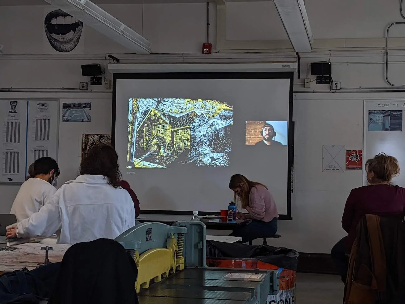
Monday, March 29 - Zooming with Reinaldo Gil Zambrano
Reinaldo presents his work starting with his drawings and how he transitioned to relief printmaking while pursuing his MFA. He explains the themes present in his prints, such as memories and the experiences people have within that we normally can’t see. He then goes on to detail his experiences after school, including, how he was able to print without a studio, becoming involved in community projects and murals, teaching, and co-hosting a printmaking podcast (Pine.Copper.Lime.)
I particularly liked the idea of ‘activating space’ where an art piece can enhance a space or location to bring a new life to it. He mentioned this with regards to murals, but also to three-dimensional printed pieces.
Reinaldo also considers himself a full-time daydreamer, which I resounded with.
Afterwards, Reinaldo answered questions from the students.
Jim goes over projects and due dates since there are 3 weeks left of class. Some due dates are shifted back and the T-shirt woodblock is now optional. Changes will be updated to the class website and Moodle page.
Jim then does a short demonstration on mixing inks. It’s very similar to mixing oil paints and you can achieve colors if you understand the color wheel.
Jim shows how to prep an ink can when it hasn’t been used in a while.
There are specific additives that can be used for different purposes:
Tint base - to add translucency to colors.
Magnesium carbonate - to stiffen ink.
Plate oil - to thin ink.
Dullit - to reduce sheen of ink when dried/ increase how matte it is.
Setswell - makes surface of ink dry faster in order to print another color on top. Also helps to reduce salting.
Use only 5-10% (volume) when mixing additives.
Wednesday, March 31 - Workday
Jim shows some sample prints to the class. There are a variety including, woodblocks, black & white, various color techniques, and various scales. The prints are left out for the class to look at later.
The rest of the class is a workday. Everyone is focusing on Project 4: Multi-block / Chiaroscuro.
Jim does the rounds and helps students as needed.
Week 13
Monday, April 5 - Workday
Jim starts class by reviewing the rest of the semester schedule:
Today: workday; finish multi-block project
Wednesday: t-shirt printing
Next Monday: multi-block due
Next Wednesday: workday
Following Monday: Class Portfolio Due.
The class is feeling the pressure. Some have already started printing and they discuss the issues they experienced. Most of the students are carving or preparing to carve their blocks.
Jim assists students as needed including:
Advice for printing with color inks - how to avoid over-inking, drying time between layers of ink, proofing with newsprint.
Helping students with registering their key blocks.
Helping students print.
Students look at each other’s prints and discuss techniques including hand-printing.
Some portfolios are put out for viewing.

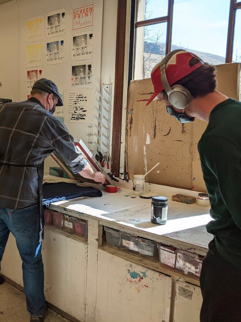
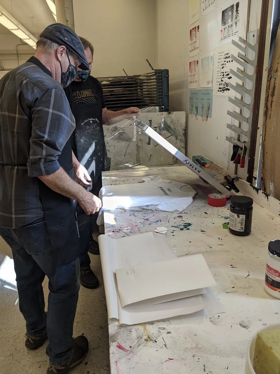
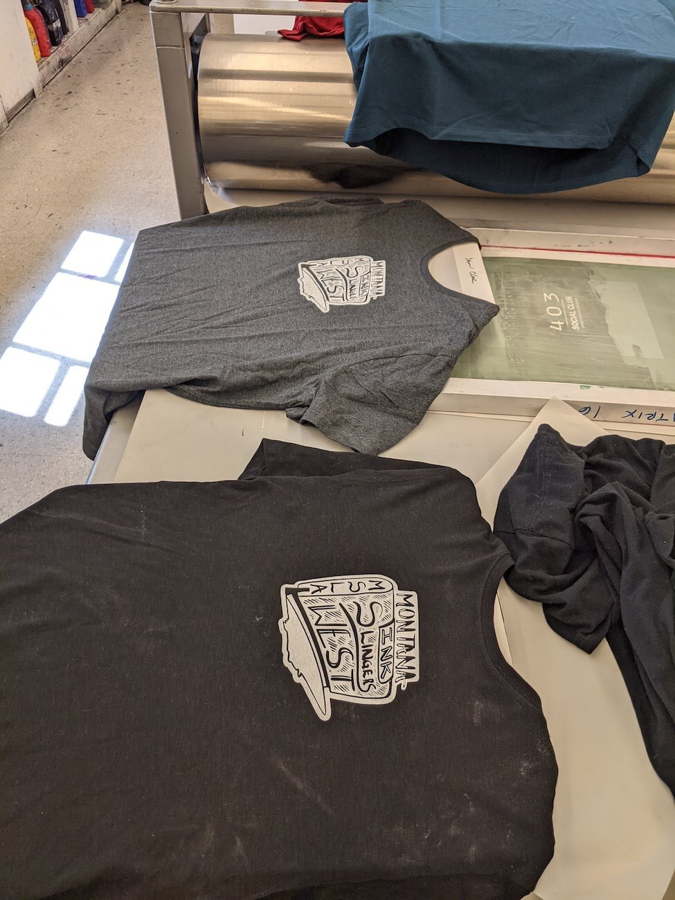
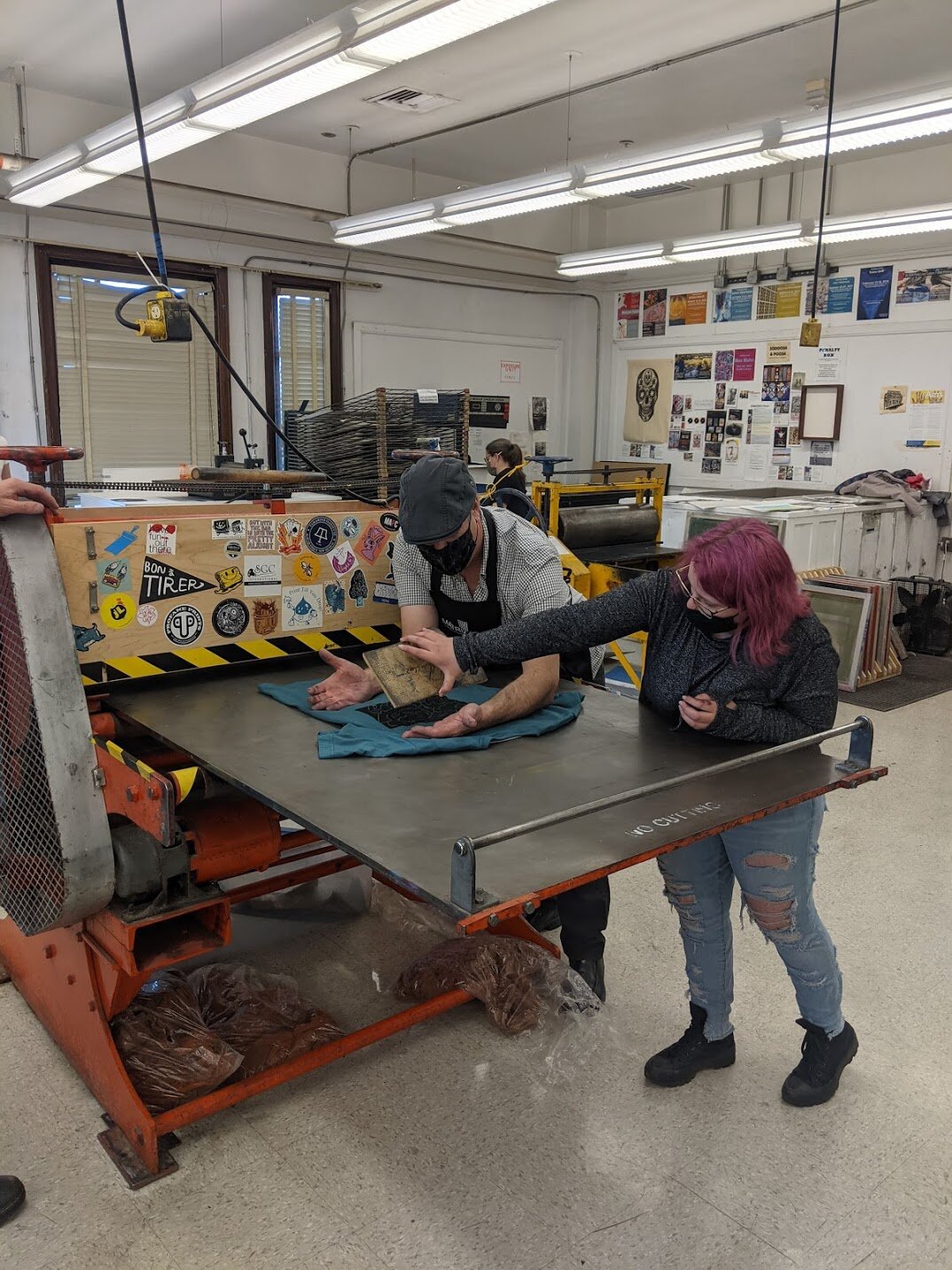
Wednesday, April 7 - T-Shirt Printing & Workday
Today is the last class day to work on Project 4: Multi-block / Chiaroscuro before their critique on Monday. Jason joins the class today to assist with an optional t-shirt printing activity. The class can choose various printmaking images to screenprint onto t-shirts, aprons, and other cloth items.
Most students are working on Project 4 and some are starting the class portfolio assignment.
Jim juggles screenprinting and assisting the students. There is an issue with transferring images onto the blocks - the citrus stripper doesn’t seem to be working properly. Jim and Jason work together to troubleshoot.
Week 14
Monday, April 12 - Critique of Project 4: Multi-block / Chiaroscuro
Today, Project 4 is due. The parameters for the project are as follows:
Minimum image size of 6”x8” on Baltic Birch, with a minimum of 1” clean borders.
Minimum of two blocks
If using two blocks, print two color variations; if using three or more blocks, color variation is optional.
Jim changes up the critique format. The students pin two color variations of their prints on the board and then distribute some of their other prints among the tables so that everyone can view them up close. The critique starts with a cold read and first impressions then it is open for conversation. Jim reminds the class to consider what’s working, what could be improved on, and to be active in the critique.
Most of the comments are very positive. There are a couple of students that don’t join in on the conversation.
The prints are collected for grading.
Wednesday, April 14 - Workday
Students are purchasing paper and blocks from Jim in preparation for Project 5: Class Portfolio. Jim reminds the class that the project is due on Monday and to make sure the prints are on 11”x14” paper. The critique will be a show-and-tell style: we’ll go around the room and the student will introduce their print while holding it up for everyone to see. The critique should be short enough that there will be time for a ‘block party’: t-shirt block printing with precut blocks. Jim shows some of the blocks available for printing. Prints from the last critique are distributed back to the students.
The students are at various stages of the process. Some have already started printing before today. Some students are prepping paper, drawing up their ideas, or carving their blocks.
Jim is trying out a spray version of the citrus-strip since the gel formula wasn’t working too well before.
Week 16
Monday, April 19 - Critique of Project 5: Class Portfolio & T-shirt Block Party
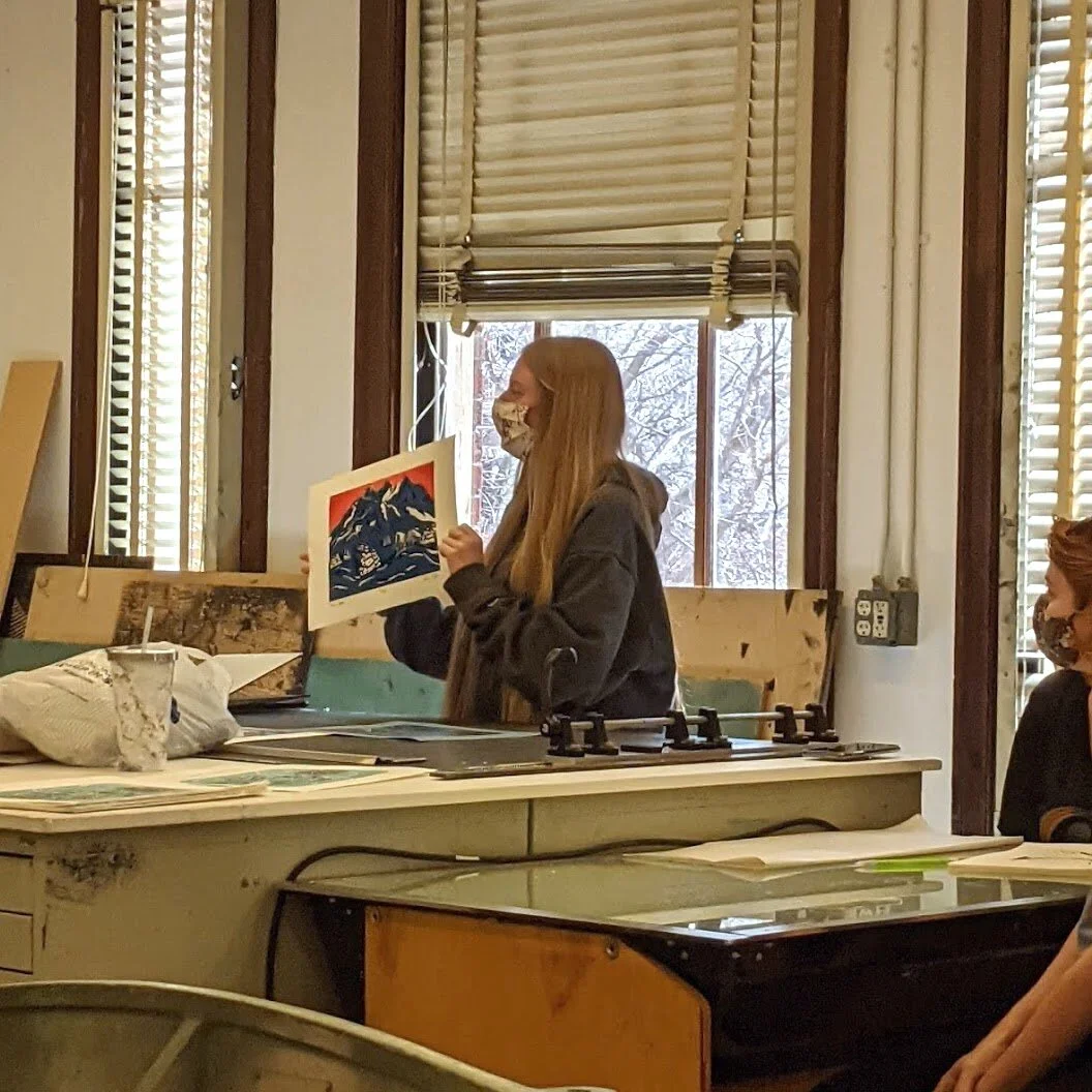
Students are putting the final touches on their prints before class starts. Today’s critique is very brief; students hold up their print and present the concept along with how it fits into the theme ‘The View From Here’. We keep moving from student to student without having and in-depth conversation. After everyone has presented, Jim instructs the students to order stack their prints numerically with edition 1 on the top. They turn in their stacks to Jim for grading.
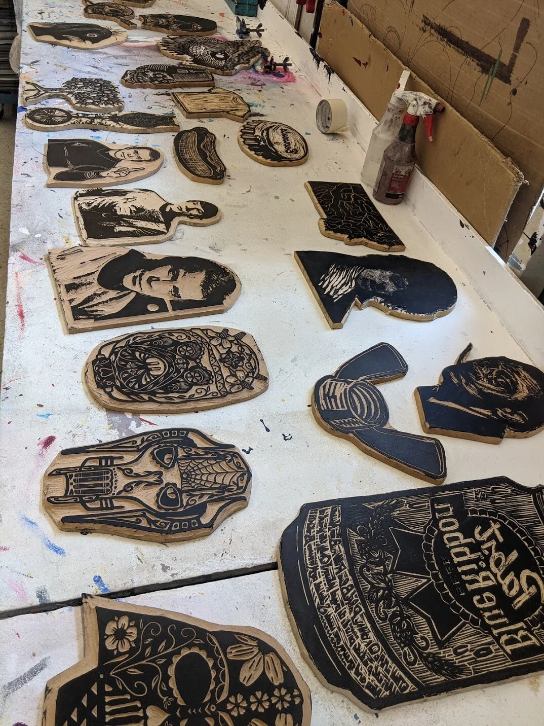
The class now has the option to participate in T-shirt woodblock printing. Jim and Jason prepare by laying out the various blocks, ink, and calibrating the presses. There is a variety of designs including the state of Montana, Bigfoot, Day of the Dead Star Wars figures, fish, Salvador Dali, a T-shirt, teeth, and more. The students are also allowed to use their previous blocks to print on T-shirts. Most of the class participates, while the rest leave early.
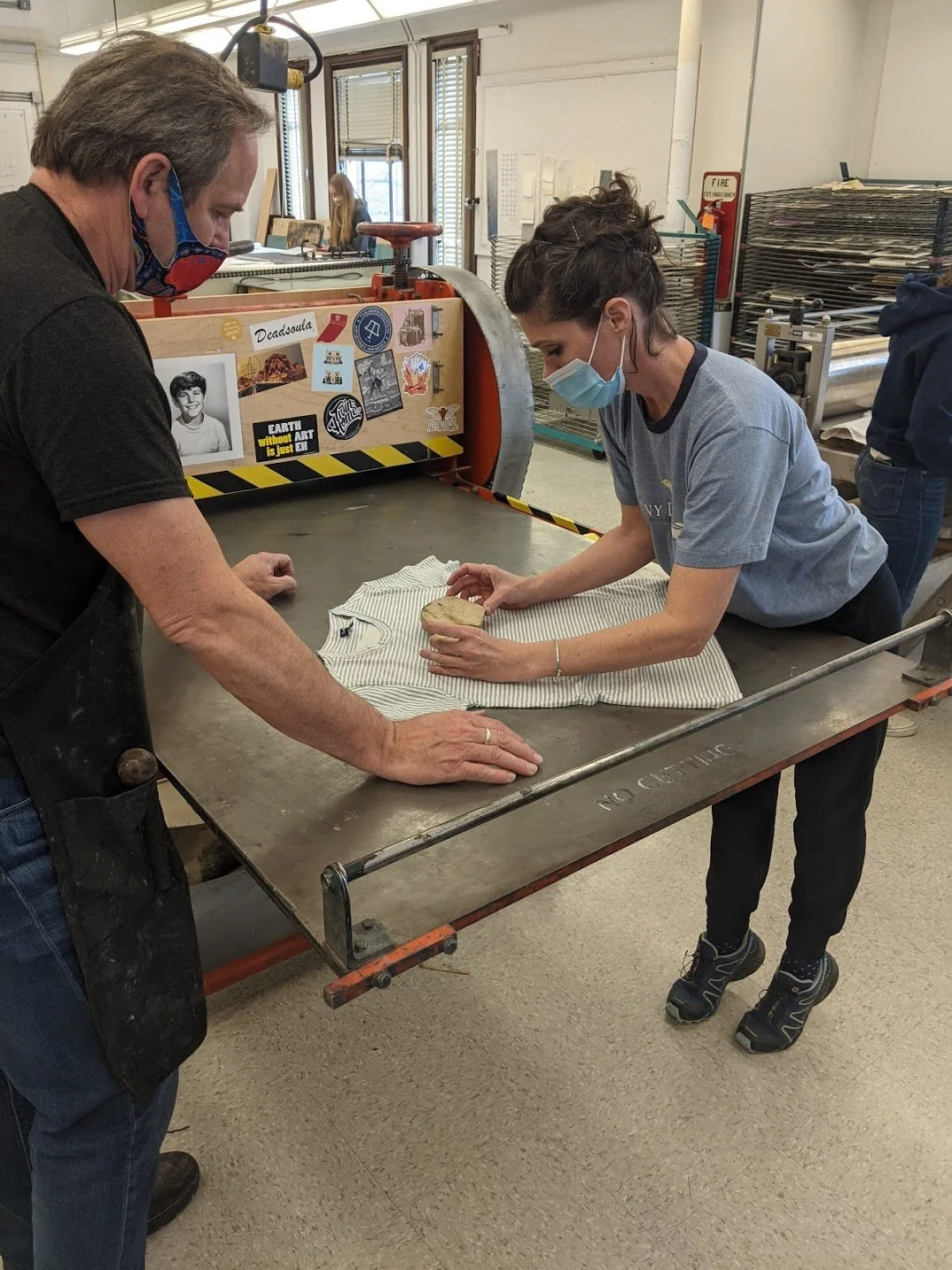
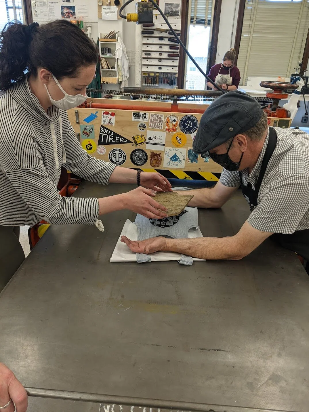
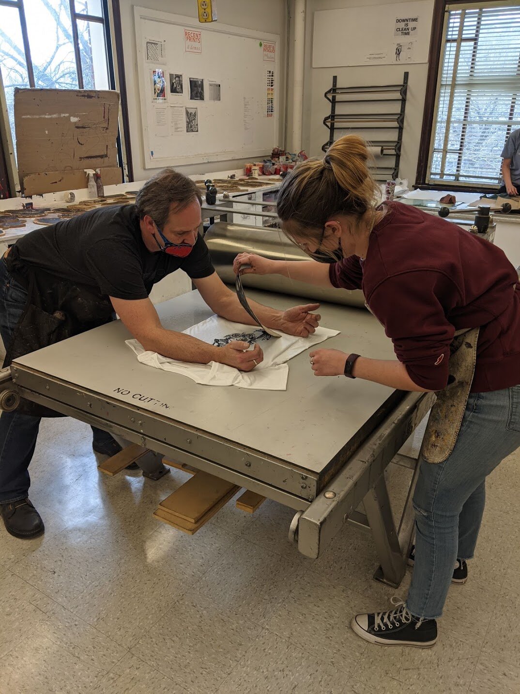
Jim and Jason show the students how to position the blocks and help with the final removal since the shirts want to lift up with the blocks.
Afterwards, Jim encourages the class to take the initiative to help with clean-up. Students work on cleaning the brayers and work stations.
Wednesday, April 21 - Class Clean-up, Class Portfolios


It’s the last class of the semester before finals week. This class has no finals, so the class will be helping to give the studio a thorough cleaning. Students from the relief printmaking class as well as from the lithography class are quickly finishing up prints since there will be no more printing after clean-up. As class starts, we wait a little bit for more students to show up. Jim has the class gather around the work areas and gives a quick demonstration on how to clean the ink cans, the brayers, and the surfaces of the tables as well as the printing presses. The students disperse and begin cleaning. Jim and Jason supervise; they guide the students by showing them were to put the clean tools and deciding which ink cans can be tossed. The clean-up goes by pretty quickly with everyone working together.
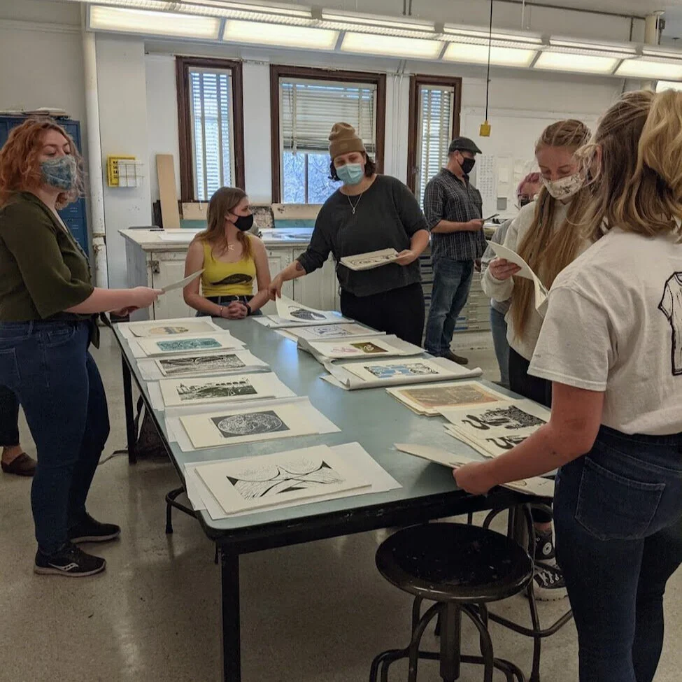
As students wash their hands and get settled again, Jim lays out the student’s stack of 16 prints from Project 5: Class Portfolio on the front-most table. Students will get one print from each student in the class, so he explains how each student will collect prints in an orderly fashion. Jim will draw names randomly, the first person will collect edition one from every stack, the second person will collect all the edition 2’s and so on. They are instructed to start from one end of the table and circle around in a train-like fashion, making sure to check the edition numbers.
I think some of the students were either confused or simply not paying attention, because there were a few hiccups in the collection process. Some of the students didn’t start collecting prints from the same starting point, so the order of prints got mixed up. Some of the students didn’t check the edition number which added to the mix up.
It was surprising to see how out of sync everyone was after they worked so well on the clean-up. Perhaps in the future, the prints can be laid out in a line on a longer table so that it’s very obvious where to start. It might help to limit congestion around the table since students were trying to work around each other.
In the end, everyone got a collection of prints and left class early.
Conclusion and Final Thoughts
This class was really fun to shadow. I enjoyed learning about relief printmaking and seeing the development of the student’s projects. It felt like Jim really packed a lot into the class (demos, presentations, projects, visiting artists, student presentations, quizzes, sketchbooks, and bonus activities), so it was helpful to observe how he juggles everything. I think it was valuable to see how flexible Jim was with the class in order to give the students enough time for their projects. The class website was very useful—I would often refer to it when students had questions about due dates or project requirements, plus I used it a lot for this blog. All the projects were relevant for the printmaking techniques, but I also appreciated the student presentations on relief printmakers. It was nice to see the students excited and inspired by other artists; I think it really helped to open up their perceptions about what you can do in printmaking.